

how to mix patterns like a pro
You’ve seen it. That drool-worthy Pinterest or Instagram photo of an interior dripping with pattern. We make it look so effortless, right? And your gut might be telling you that although we make it look effortless, it actually take a lot of effort… and I’m here to let you in on a little secret.
mixing patterns is super easy, bro.
Okay, okay. So you’ve googled every single blog and yes, you have followed every single piece of advice out there. And yet somehow, the pattern-mixing Brownie/Boy Scout patch seems out of your grasp. Whenever you try to mix patterns it ends up looking like the discount section at Marshall’s (no offense to Marshall’s but that is where good fashion goes to die).
That’s because they’re leaving out one small but crucial detail that is the key to making it work. That’s so mean, right? And I’m not mean. I mean, I am. But not to you.
But before we can get to that, we have to go over the basics.
pattern scale
Every pattern story has to do with scale. The great news is that EVERY room has these scale sizes, even the smallest ones. If you really think about it, the whole world is a mixture of patterns, not just decorative prints on a wallpaper. It just depends on your point of view.
Think of the whole room as a palette to mix patterns in and then it becomes easier to break out of the decor cul-de-sac that has become your mind.

Frances Merrill, Architectural Digest
Gigantic - this can be one solid wall color, one giant image, or a wall of windows, or the floor and ceiling. Even a room completely painted in white counts.
Large - big impact, large images. This can either be a painting, large format wallpaper, a mural
Medium - Big enough to determine its shape, but not as impactful as the large image
Small - too small to see any detail unless you are really close up.
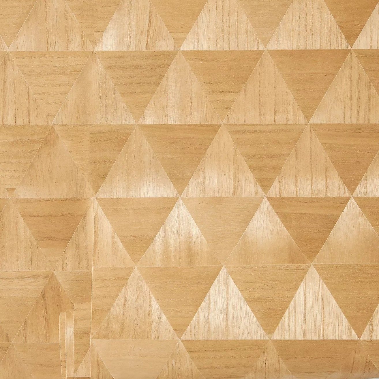
Tiny - on the micro level, these are the textures of the material.
Can you spot the different scales in the GA-GA-gorgeous home designed by Frances Merrill of Reath Design. Take a minute to scroll through her AD spread. There be lessons to be learned in them pictures.
The floor is the largest pattern in the room, followed by the wood slats, and then the kelly green curtain. Next are the bricks, the painting on the back wall, flowers, the yellow pillow, the sofa and chair patterns. Then the lamp, the large pillow, and coffee table patterns are the smallest to the naked eye.
As for the tiny, the tiny patterns, those are the bumps on the bricks that catch the light, the imperfect surface pattern of the textured rug, the ripples in the curtains. And let’s not forget about the thousands of green leaves shimmering in the sunlight outside. If you think these do not have anything to do with pattern, think again. These are lines and patterns your eyes see and contribute to the overall picture. You’re just thinking small if you think these don’t matter. A good designer keeps these things in mind when putting together a room.
I might be missing some things, but you get the gist.
It’s a lot different when we look at a picture and don’t just dissect the printed patterns but the image as a whole. It is a symphony of balance. No one same scale pattern is layered on top of the same scale pattern.
You might be thinking “No Duh, that’s how most things work when you layer them together.” But no, grasshopper, let me explain. If you don’t think of the room as a whole vs. a few collected items that happen to be in a painted room with a ceiling and floor and window to a lawn outside, then you will not understand how to play with the patterns and how important scale really is. The next step to understanding is being able to riff on these ideas and create your own thing. Not understanding is how patterns become stale and not magical like Ms. Merrill’s creation.
IT’S COMPLICATED
is the title of a Meryl Streep film. This next step is actually not that complicated. Ok I’m going to stop being cute.
I break down patterns into two categories: simple and complicated. I don’t think I even know how to really, truly define these things but here I am writing about it.
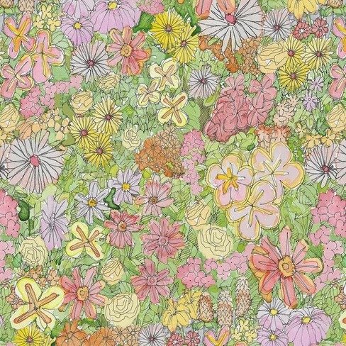
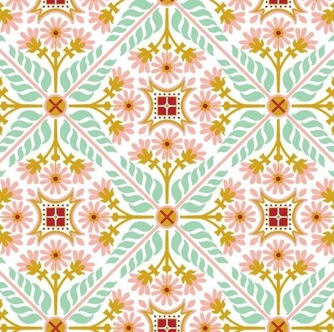
Simple designs and patterns are less visually complicated. Oh boy, I just used the antonym to define the word. That’s a no-no. Let’s try this again. Simple designs are straight, less busy, clean. Think graphics and lines and circles. They don’t have a lot of squiggles.
Complicated designs are… ok you get the idea. But I can also show you a few pictures.
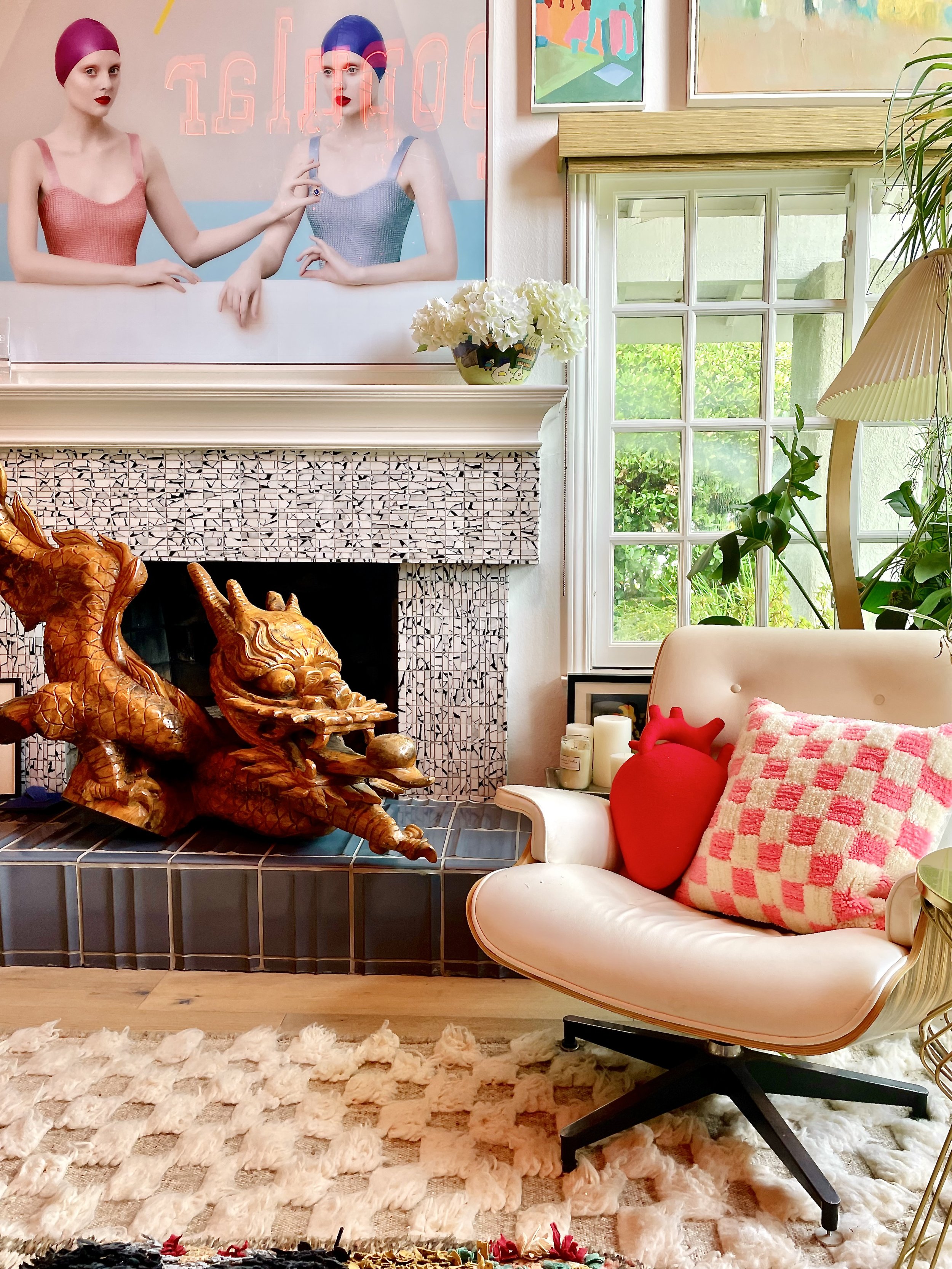
Do you see how they WANT to be together? Two peas in a pod. These two would happily live side by side, together. Forever. Don’t believe me?
Yuck.
Meh. But still yuck.
But hopefully that illustrates why complicated and complicated together is just a big ole mess. Think about it — in your best relationships, someone is always the rock and the other is always the dreamer. And contrary to what you might believe, I’m the unfussy, simple, uncomplicated plaid one in the relationship while my partner is the crazy, wild, and unpredictable one.
You see how the eye just wants that polarizing differentiation. It somehow makes it feel more balanced vs. off-kilter.
So now we have two of the pre-requisites down for pattern-mixing. Are you feeling more comfortable now?
drum roll please…
I’m sitting here at this keyboard and I’m about type something that will revolutionize the pattern-mixing game for everyone who reads it. I’ve read so many blogs that barely touch on this subject, but to me this is the most crucial element and separates the amateurs from the professionals.
do not match your colors perfectly.
Whaaaaaaaaaat??????
It’s really that simple. Just. don’t. match. your. colors. perfectly. You can mix similar colors, but just don’t walk around with swatches from your favorite pillow trying to match the paint and the curtains and the wallpaper and the sofa and coffee table and the wood and the lamps and the…
Matching colors perfectly gives your overall design a “just bought this from Target at the same time” look. Don’t get me wrong — I buy stuff from Target.
But I never ever under any circumstances put these things together. I don’t even keep sheets together with the same matching pillows or fitted sheets. I know it’s tempting to fall into that trap. There’s a reason. It’s because it’s soooooo easy. But trust me when I say this: fight the urge to match everything perfect. Remember that balance that I spoke so highly of before? Fuck it.
Now I’m gently asking you to forget about it. Too much balance is the Marshall’s discount rack. It’s your second-grade school photo day outfit. In other words, not terrible but NOT COOL. At least not as cool as this:
Do you see how the yellow in the lamp does not match the chaise lounge? And the green in the side table does not match the curtains? I mean the red just comes out of nowhere like a beautiful color nymph. But somehow we know it belongs.
This is because Frances Miller is a baller. The ultimate baller move in the pattern-mixing game is to take colors from other parts of the house and place them strategically elsewhere.
I also do not care about the 60-30-10 rule. This is the rule that 60% of your room is one color, 30% is the secondary color and 10% is the accent color or whatever nonsense they’re hocking out there. Okay, hot shots (not talking to you, you’re cool, just talking to the other bloggers out there). Next time you design a room, I want you to break out your calculator and see if you can design something like this using that rule:

Even though nothing matches, somehow we feel confident that everything she has placed in this home is utterly perfect because everything shows up again and UNEXPECTEDLY. If you’re thinking of placing that perfectly matched pillow in one room, save it for another room.
There is also some nonsense about using a color wheel when matching patterns. In theory, yes this is very important. But I live in the real world and not the made up fantasy reality we have cultivated on social media. Use the color wheel to create “balanced” and “harmonious” interiors…
In other words. Boring. It’s ok to want to live in a nice house. But every once in a while, try something bold. It’ll wake you up, I promise.
And when in doubt, throw in a black and white pattern. That always seems to do the trick.

I swear by these guidelines and know they will help you on your journey to mixing patterns not just like a pro but an artist. Because sometimes pros do things by the book and artists do things because they feel “right.” You want to be the latter.
And as a special gift from me to you, I now doth bestow upon thee:

Wear it with pride (you can also download it and show it off to your friends on social media along with a link to my membership page. If you want).