

Week 8: The Final Reveal
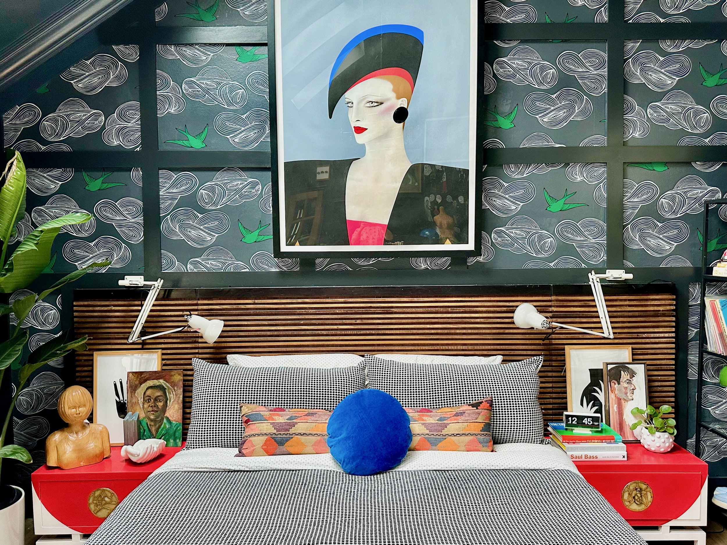
Her name? Carlotta. She is a vintage Harrod’s poster by Gerald Razzia. I love her because she looks like a total bitch. She can decimate you with her icy stare.
And until Carlotta came across my path, this room was a total mystery to me.

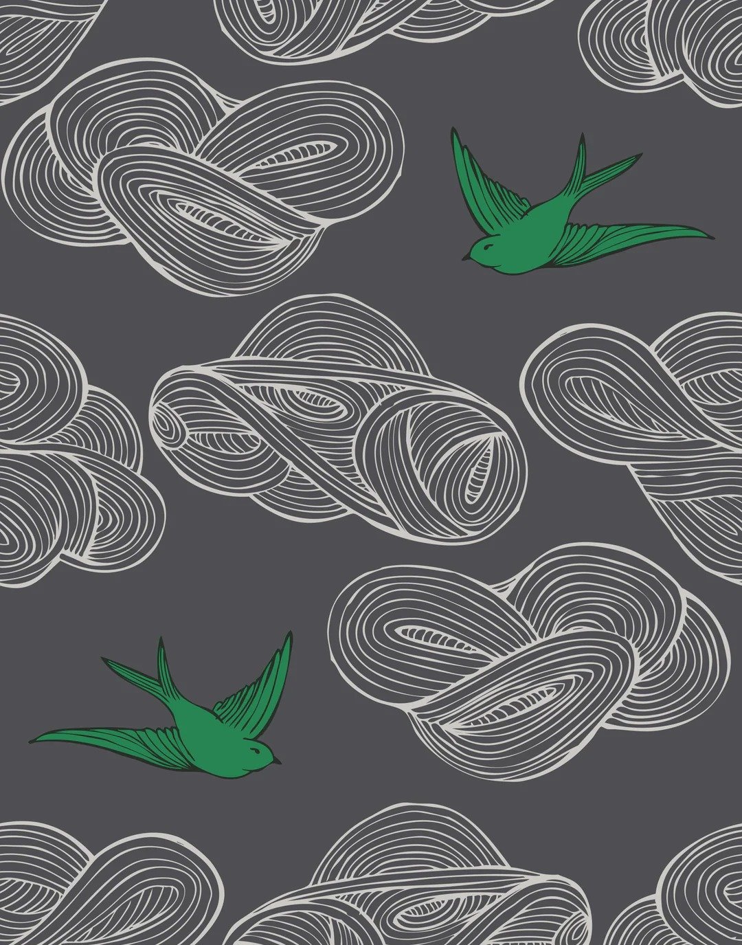
I wanted to keep the black, yellow and green palette and it was driving me crazy. I felt so boxed in and trapped into the idea that I could only use those colors. If you have been following my process, I knew that the room HAD to be black. And then I also knew I didn’t want to cover the entire room in wallpaper. I just wanted one wall. So I opted for this wallpaper:
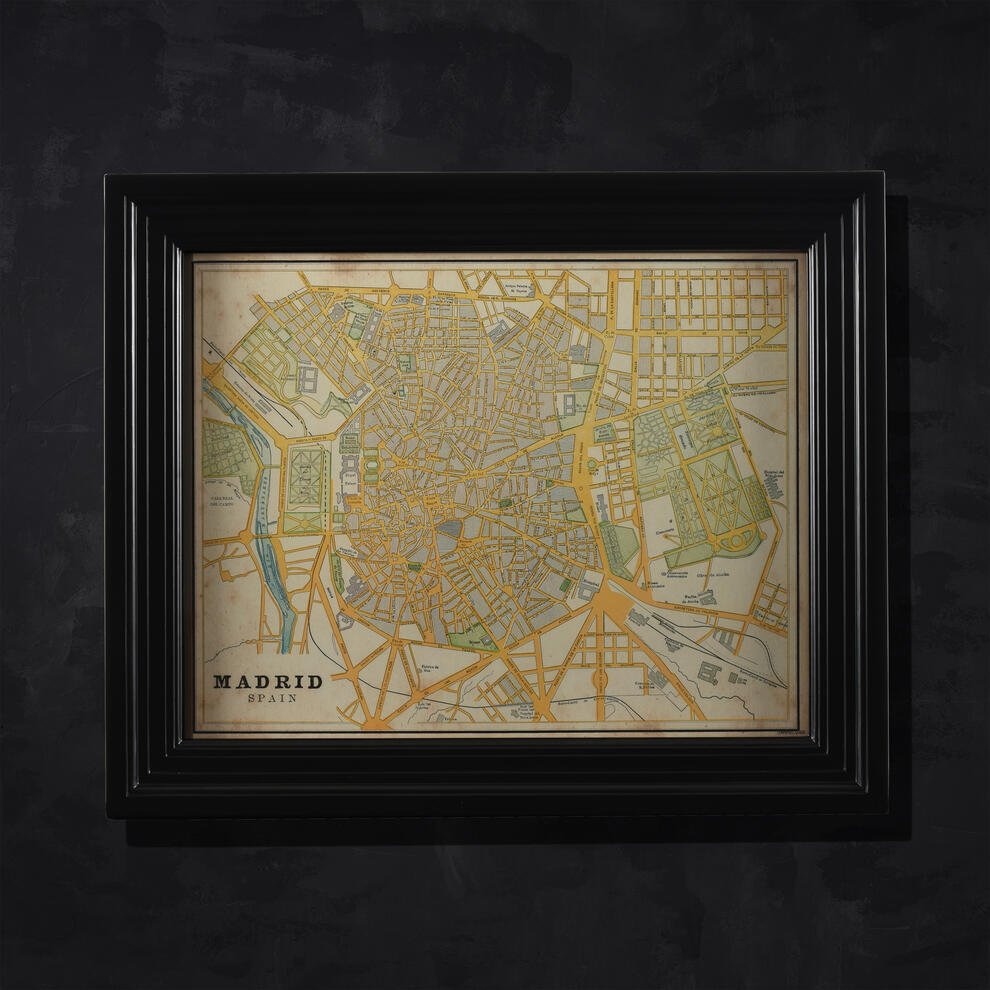
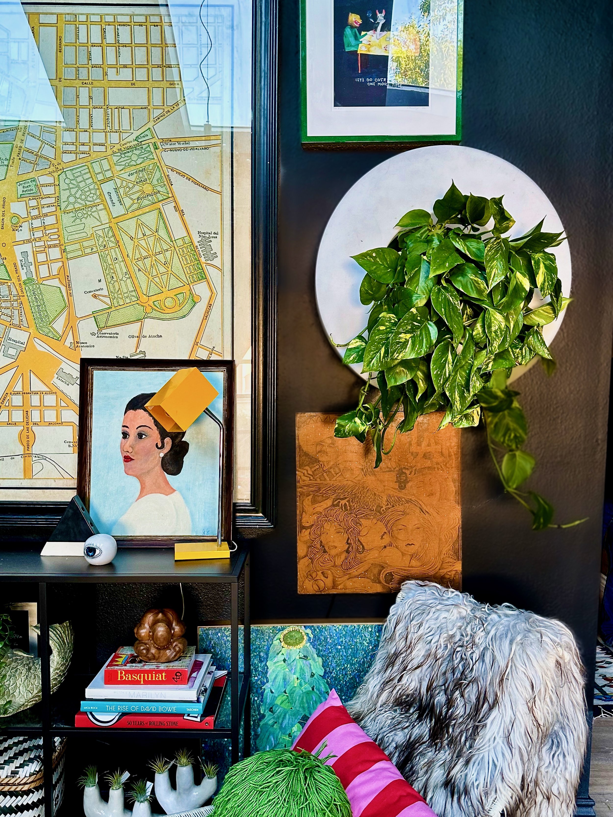
I also have this map of Madrid could not go anywhere else:
And then came Carlotta. Carlotta was an accidental find, actually. Somehow, somewhere, I started searching Chairish for a giant poster. I’m crazy like that. At first, I couldn’t tell the size of the image. But sure enough, it was gigantic.
I thought then, though, how punk rock would it be to go in a completely different direction color-wise but keep with the same feeling? This was not expensive for what it was - 63”x48” French Grande poster size. And then I visited Shop NFS and as luck would have it, there she was again, only now $2500. As soon as I got home, I purchased it on Chairish for $600 and thought, well if this isn’t a sign!
everything in it’s right place
Now that Carlotta was literally in the picture, now I could rethink the ENTIRE room. That meant the nightstands:

I love this picture because it shows the detail of the rug. In fact there are going to be a lot of details missed due to the nature of photography and the fact it has been CLOUDY ALL WEEK in what is supposed to be Southern California.
These are Frank Kyle nightstands with Pepe Mendoza hardware. They were in terrible shape when I purchased them, so I didn’t feel too badly about all the crap I did to them:
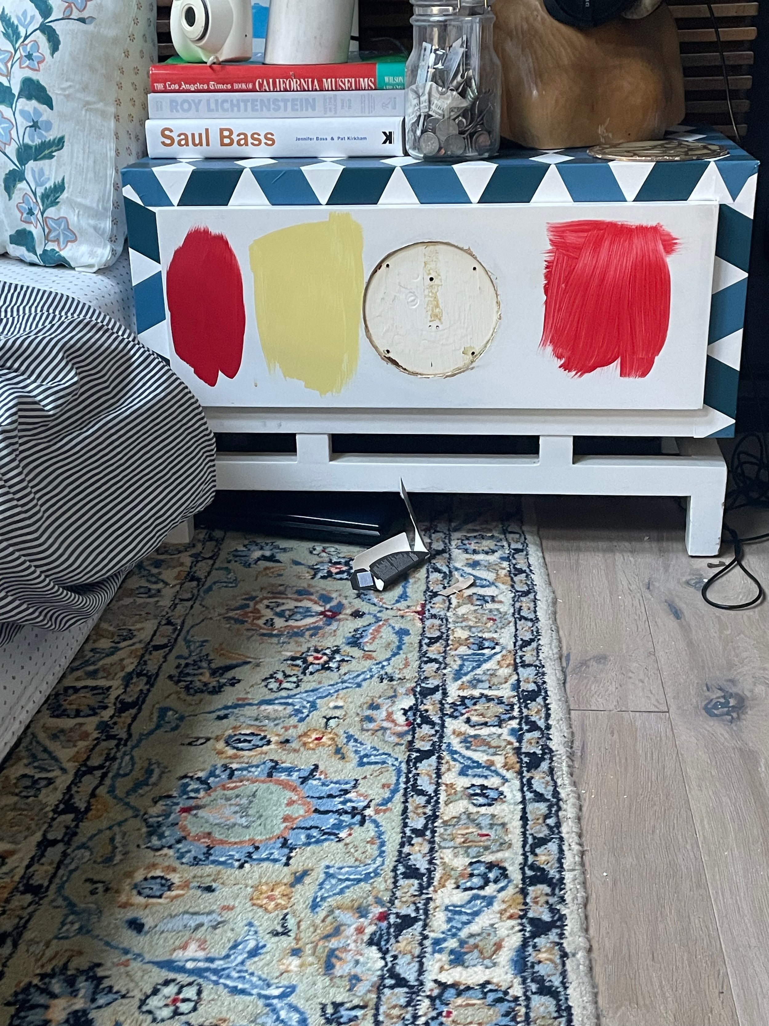
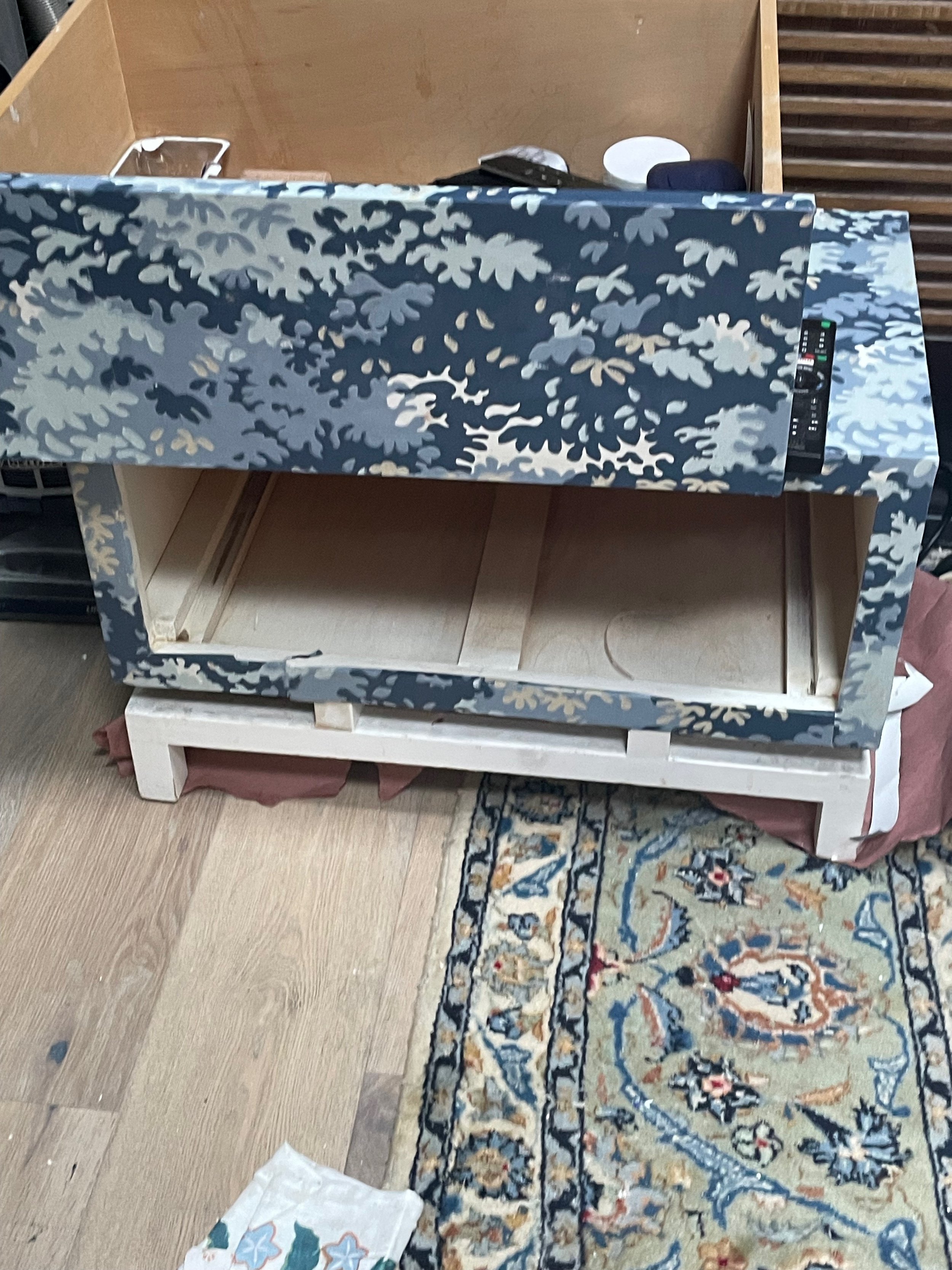
First, I covered them in some Wallshoppe wallpaper and then the Into the Woods wallpaper is also spectacular.
But that just simply was NOT WORKING. Carlotta turned that around — I took the red from Carlotta’s crop top, hat and lipstick. I didn’t want to paint the whole thing RED so I asked Paul the painter to help design a half circle of red.
As for styling and lighting, I tried a variety of lights but nothing felt right until I decided to mount the lights to the wall. I love the industrial aspect of the Anglepoise 1227 lights and that way I could use all of the nightstand real estate to style.
Finding Carlotta also allowed me to paint the dresser this beautiful blue:
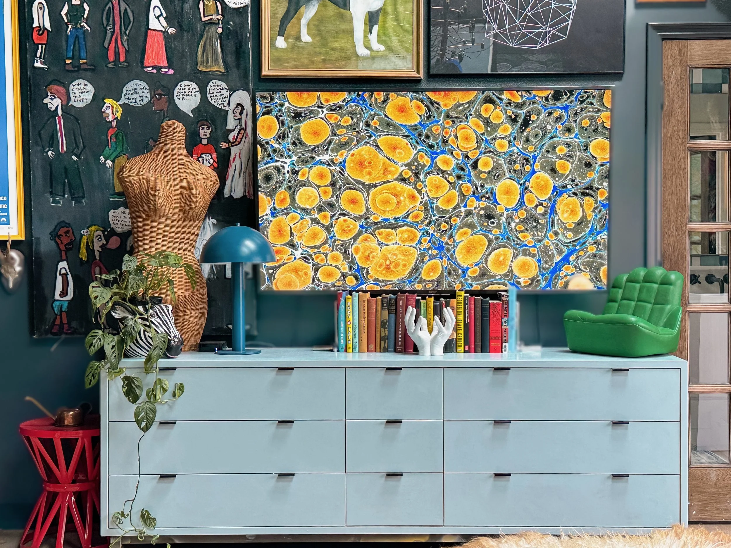
This is Backdrop Early Stuff leftover from another project. Imagine that? Leftover… And guess what? It matched with the tile pattern in the bathroom!!
I can’t wait for the sun to come out in Los Angeles so I can take a proper picture of the dresser. But it ain’t bad for right now.
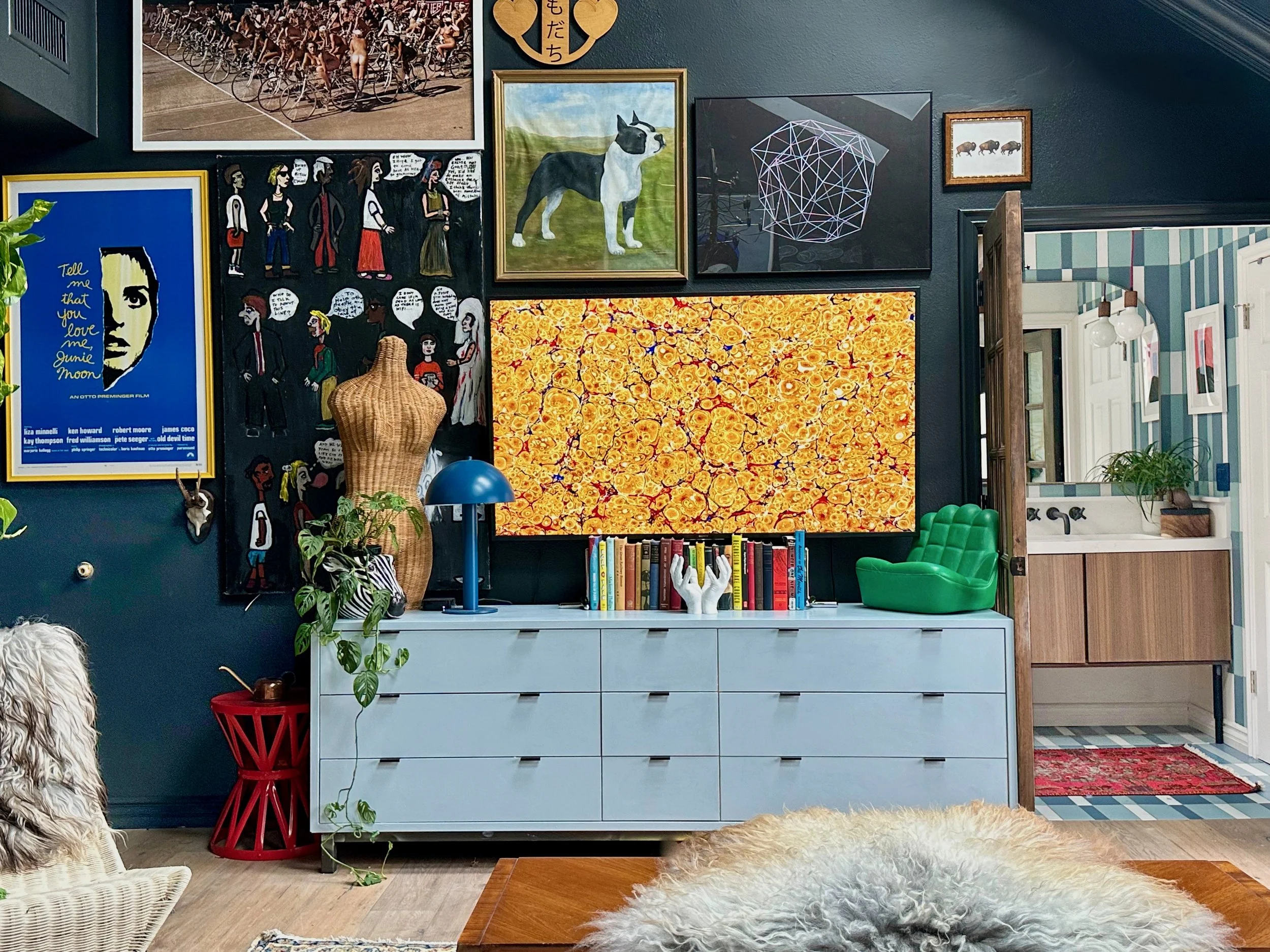
Using alternative colors to green and yellow also opened up the possibilities for the shelving wall:

UGH! So many clouds. When it’s beautiful and sunny out, I’ll take more pictures.
Big shout out to Shop NFS, but also Formas LA and Lackluster for their fun styling items. There is almost TOO much stuff but I didn’t want it to feel bare. Believe me, I killed a lot of my darlings here. I could probably kill even more but the loss is still raw, so I’ll wait for the clouds to dissipate and pare it down even more.
You’ll notice that I even hung some paintings and pictures BEHIND the IKEA shelves.
The round light is a vintage 70s pendant that I attached to the wall and yes it lights up! Speaking of…
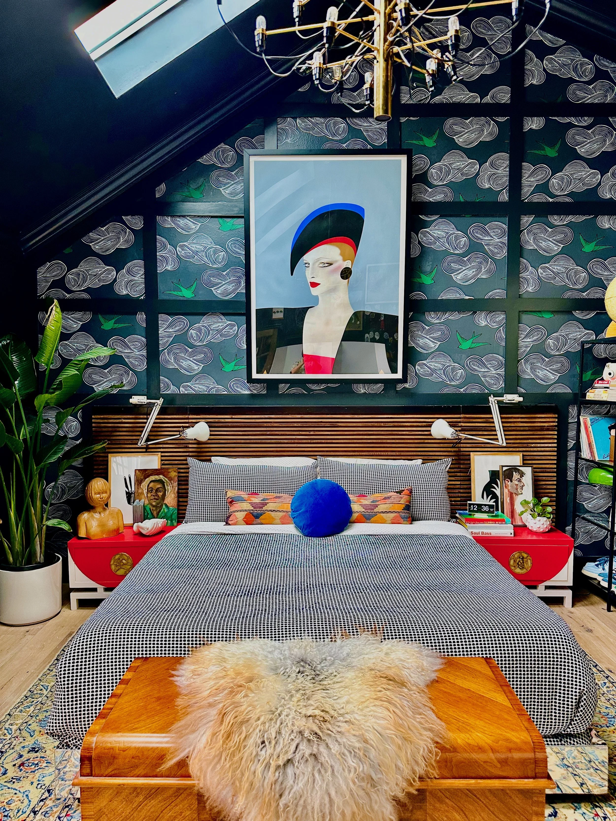
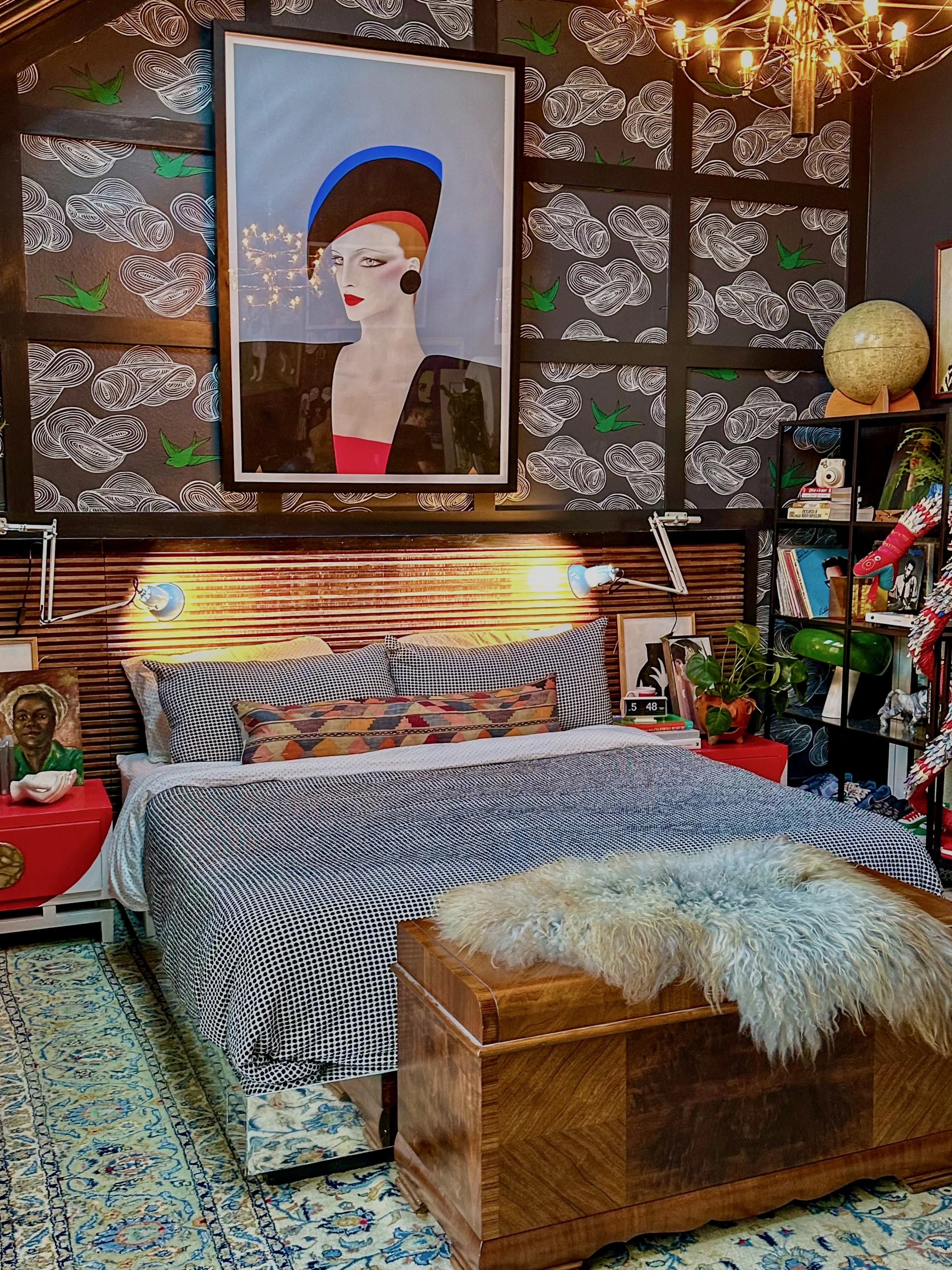
The chandelier is a replica of a Gino Sarfatti Flos 2097, so minus the price tag… ALSO, yes the bed frame is chrome.
Let me tell you. Getting the chrome on the bed was what literally took all 2 months. Simply because this is not something you come by every day at Michael’s. At first, we tried a chrome paint because we thought there was only cheap looking laminates out there. The chrome paint DID NOT WORK whatsoever. Do not try to paint wood with chrome paint. If you think, “Well no shit of course I wouldn’t do that” the products advertised that they could. And they were super expensive.
Then when that didn’t work, we tried the cheap laminate and that just bubbled and looked cheap. Then at the last minute, my handyman found chrome sheets that he could solder and buff to the bedframe. That was exactly the look that I wanted.
So even though you only get a peak of the chrome, it is literally so fucking cool I can’t stand it. Now if only the skies would clear so I could take a good picture!
the big prize.
Even though there aren’t any winners with the One Room Challenge, I feel like I’ve won the big prize. I’m not saying “My design is better than anyone else’s” or “I’ve done something better than everyone else”.
What I mean to say is…
I set out to design a room that defied expectations, didn’t conform to any typical interior design aesthetic standards, was curated and maximalist, colorful but warm, edgy AND elegant.
Since this is a whole new room, I have a brand new page for all of the shoppable items!
When you have a moment, please check out the other ORC participants and give them a round of applause.
They deserve it!
