

How i pick out wallpaper (shhhhh....)
I have been wanting and NOT wanting to write this post for a very long time. And I lied a little in my last post, in case you have been following. I ran two different polls asking what you wanted to me to post about. So while most of you voted for "How to make my house look cool" on this blog, my Instagram followers wanted to know how to pick wallpaper.
First of all, there really is no way to quantify how to make one's house look cool. But I can tell you with out a doubt that there really is a way to pick out wallpaper and I remiss to tell anyone lest I give ALL of my secrets away. Much like a magician, I can only tell you the trick to fellow magicians. AND if that wasn't enough, I will tell you five -- FIVE -- of my favorite wallpaper resources (and none of them are Anthropologie).
I'm not going to go over picking colors. Wallpaper and art should be the first things you pick out in a room. So if you love a wallpaper color, go for it. You can always find furniture and decor that goes with it.
DISCLAIMER: Please remember to get samples of all wallpaper before you decide!!!
Scale
The first factor in picking out the right wallpaper for a room is to determine image scale. We're not talking size of image repeat or even size of wallpaper. We're talking about the main images' scale
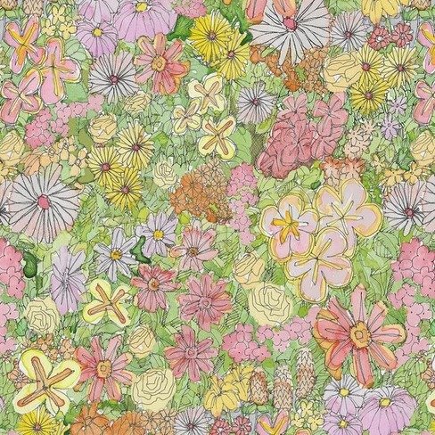
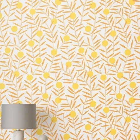
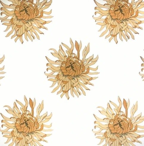
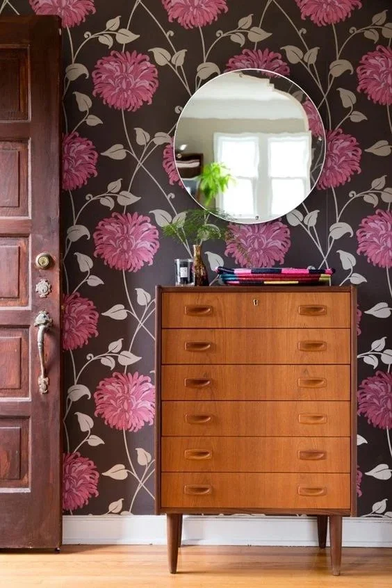
I chose three florals so we don't get caught up in themes. But as you can see, the House of Harris wallpaper has a different image size than the Abnormals Anonymous wallpaper. Smaller image size tends to be busier and have a more intense pattern while the larger image size makes more impact as a graphic vs. busy-ness. The Hygge and West wallpaper sits right in the middle.
Generally (but not as a rule, because we all know how I feel about rules), I like to use smaller patterns for very small areas like closets, niches, powder rooms and even small bedrooms. You could use a small pattern for a large room, but think about how you want the room to feel. The definition of smaller patterns will get lost more so in a larger room, so keep that mind! Here are some examples of small patterns in action:
See how the smaller image size creates a coziness and encapsulation? You wouldn't get the same effect from a larger print. There is basically no breathing room, so it's the visual equivalent of a weighted blanket. Which is other comforting or suffocating, depending on your temperament.
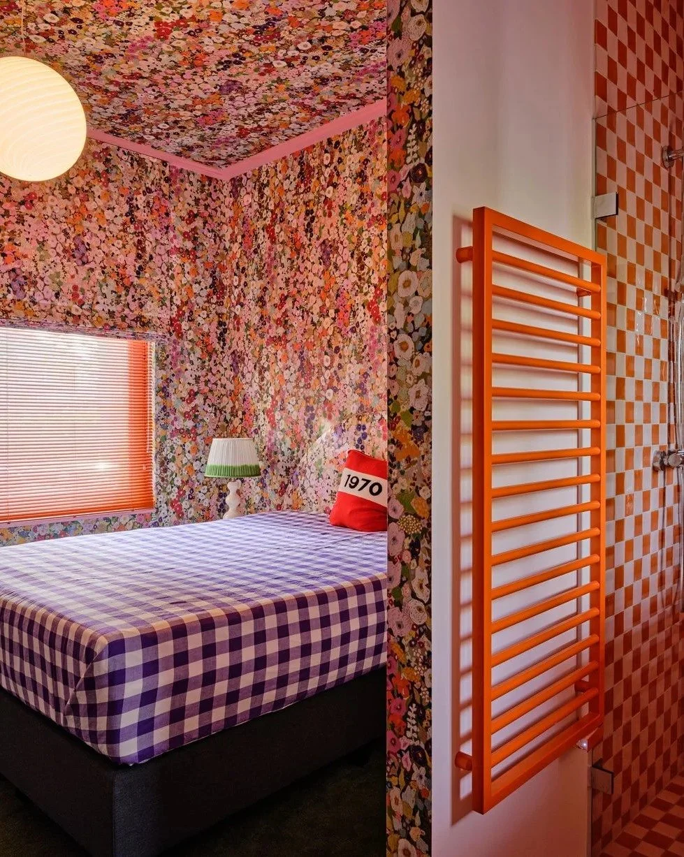
Now medium-sized images straddle the line between large scale and small scale. I like to use medium-size in smaller bedrooms (between 13'x13' and 18'x18'). The reason for this is that they are not quite big enough to call them large and not quite small enough for the coziness of the above bedroom. I like using medium formats since it actually makes the room appear LARGER, if you can believe it. And if you're brave like the above designers, @atelier.nd.interior, wallpaper the ceiling!
My guest room is about 13x15 give or take, so I decided to go with the Cole and Son Savuti wallpaper in beige or cream. Besides being very colorful, the images are large enough to make the space feel more expansive. You almost forget that the room is so small!
Now we get to the big boys, the LARGE format wallpapers. These guys are grand, they are loud, they are the belles of the ball, NOT shrinking violets. I like to use large format in -- what else -- open spaces, vaulted ceiling rooms, etc. The reason? Because you need something to fill up that wall space and little dainty flowers and small images won't cut it. Large format wallpapers are AIRY.
Now there are even BIGGER format prints available in mural form:

Due to the physical constraints of murals, they really can only go on one wall 8'x15' more or less. They are not patterned like a regular wallpaper, and thus are more expensive to make fit into spaces with lots of windows.
If I were you, and I wanted to have the greatest impact, I would put a mural on the CEILING. I know, I'm a rebel, but hey, that's the place it makes most sense. I do not like "accent" walls. To me they are just design jerk offs. If you can't commit to the whole room and only just one wall, then why even bother? I need the FULL experience or something that just seems a little more thought-provoking. Accent walls are soooooo 2013 HGTV and aren't we better than that? I'm sorry in advanced if you have an accent wall and love it. But do you? Do you really?
Perhaps the ONLY instance I would use an accent on a wall is the bedroom, behind the headboard. And it is under very special circumstances. Like if the ceiling is vaulted and the room is huge and there is some architectural feature you want to highlight. Otherwise, I'm just over the accent wall. Sorry to be so blunt!
Of course these size rules are just SUGGESTIONS and you can use whatever size format in whatever size room you conceptualize. But ask yourself these questions:
Do I want the room to feel balanced or off-kilter?
Do I want the room to feel cozy or airy?
Do I want the room to feel smaller or bigger?
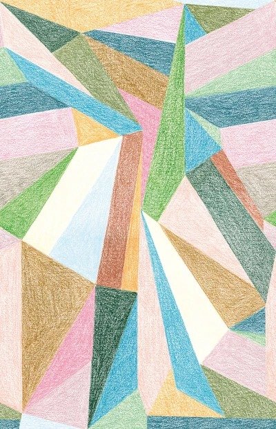
pattern
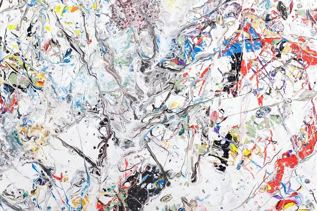
I love to think of patterns as tools and not assign any sort of opinion about them. A pattern is either graphic or biomorphic, meaning straight vs. curvy. Now our society likes to assign graphic images such as plaid, checkerboard, etc., as more masculine, and flowers and polka dots and faces are more feminine but here were in 2022 and that shit is whack. So I'm calling patterns curvy and straight from now on, no feminine or masculine nonsense.
As such, I like to mix patterns up between curvy and straight ALL the time. for example, if you have a fairly straight, mid-century modern furniture (notorious for being "masculine") I like to mix in a rounder pattern into the mix. And vice versa, if you have a post-modern curvy couch, pair it with straighter objects. Nothing strikes a more interesting dichotomy than straight vs. curvy. Nothing.
If you think about it, that's probably why floral patterns are so dang popular. They soften the hard edges of very square rooms and make it more inviting.
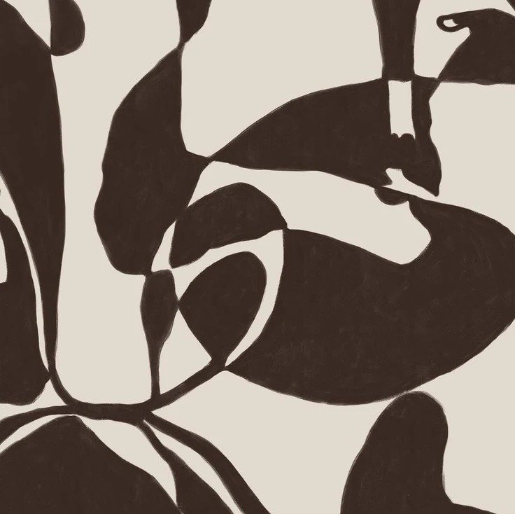
So let's say you have some sculptural furniture and need a wallpaper to go behind it:
Do you see how the straight edges of the design play against the curvature of the chair and the illustration? The colors are also fantastic, but really it is that tension between linear and non-linear that creates the visual interest.
Similarly, if you have pretty straight-edge furniture, biomorphic/curvy shapes will play well with them.
Which brings up another subject:
style
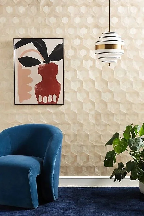
As far as I'm concerned, there's only really two maybe three styles of wallpaper when it comes down to the nitty gritty: vintage vs. modern. I don't really care what the content is - it could be flowers, it could be little ladies in boats with ukuleles, it could be alligators flying through space -- the content is not as important as the look and feel of the wallpaper. Vintage vs. Modern. And then somewhere in there is geometric, but even that can have a more modern or vintage feel, too.
The best way I can describe the difference is by showing you:
The House of Hackney Limerence wallpaper has more of a painterly quality about it -- more of a literal interpretation of florals vs. the Lake August Matilija Moonlight wallpaper which is a minimalistic, interpretation of it. Both have traditional subjects, but how the images are presented in different forms.
So who the heck cares if a wallpaper is vintage vs. modern? Well, I do, for one. I care very much so. The best way I can explain it is that if you have modern furnishings and art, I like pair it with more vintage. And if you have a lot of vintage furniture, etc., it helps to have a more modern wallpaper. This may only apply to me, but hey, this is my tutorial and this is how I do it.
You can also see it this way: vintage wallpaper is moodier and modern wallpaper is a bit brighter. I like to balance furnishings, etc., by making sure nothing is tooooo moody or tooooo bright. I love both things but in moderation.
Have you ever been in a room that feels one of the same thing? Like everything is a traditional Chippendale chair, mohogany this, 19th century that, with traditional portraits everywhere? Or if everything is mid-century modern, including the colors and wallpaper? I call it the "kitsch" factor. Yeah it's cool that everything "matches" but does that make it interesting or inviting? For me? No absolutely not. Not everything has to be a mish-mosh of styles, but tell me which one you prefer:
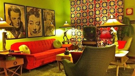
Both are colorful, but tell me which one makes your skin crawl a little when you see it.
And now what you've been waiting for:
the resources
Now comes the fun part… finding the right wallpaper!! To get access, you gotta sign up!
